
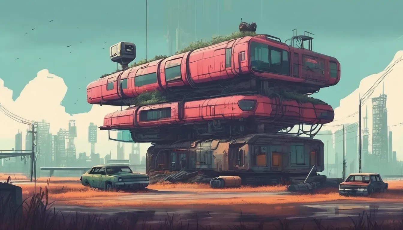
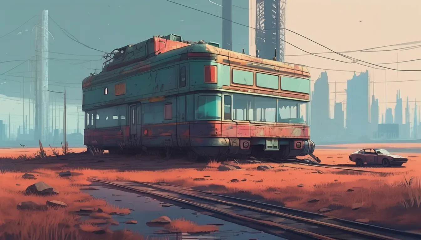
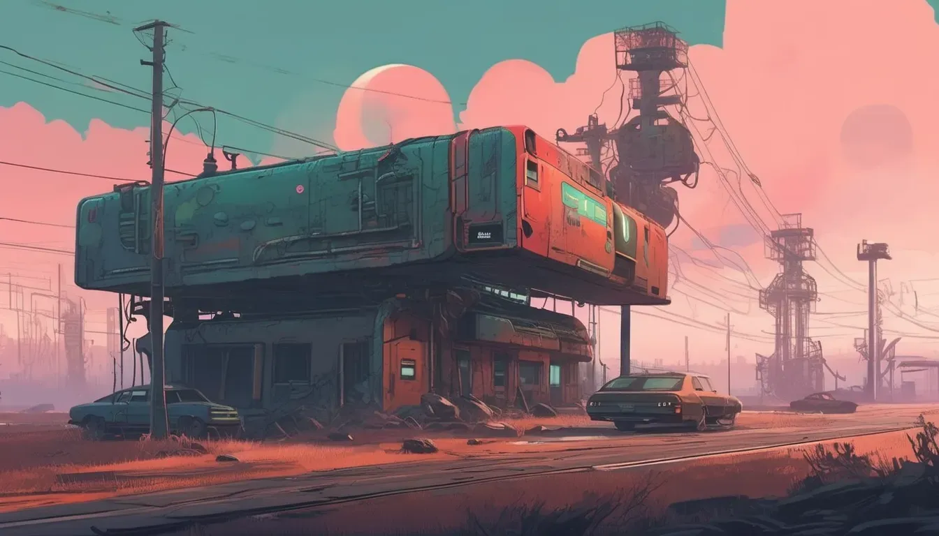
Art Style Explorations
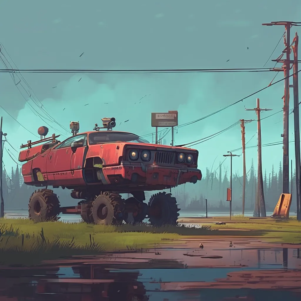
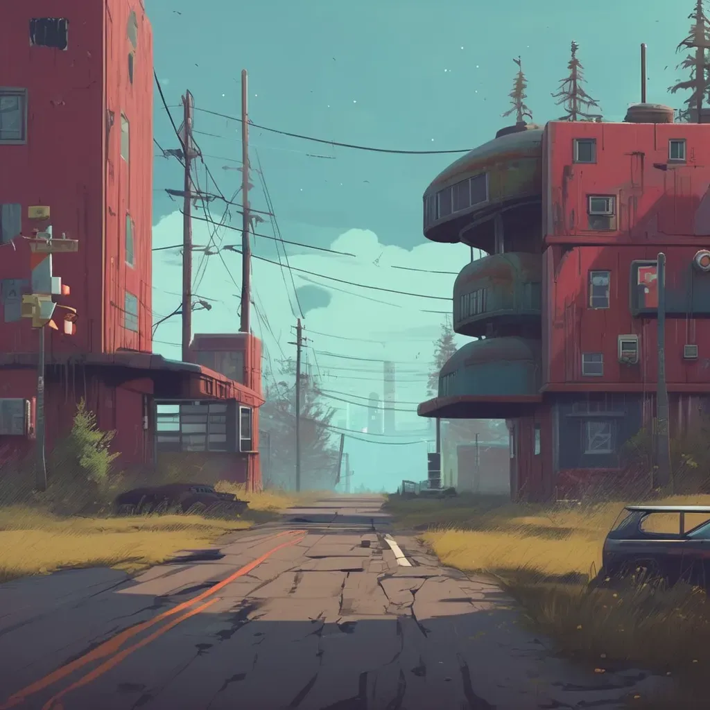
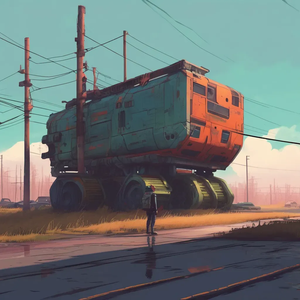
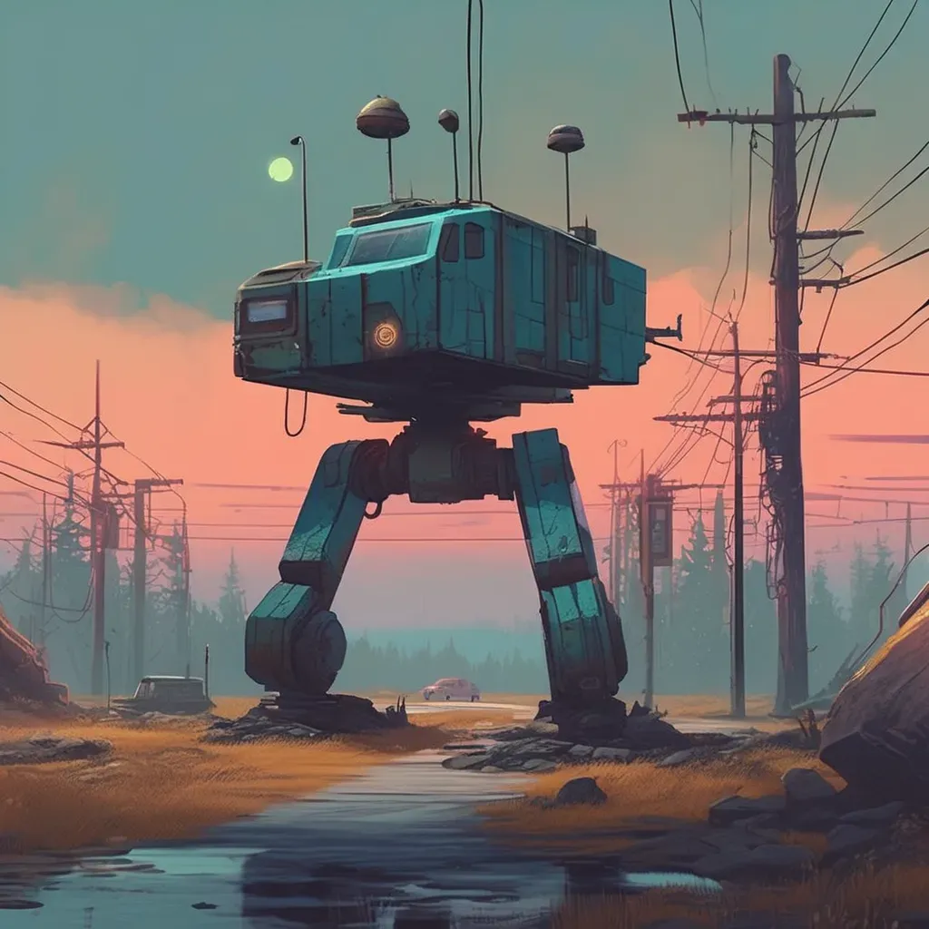
Hey everyone! This week, I’ve been deep into refining the art style for Stabby Knight, and I’m excited to share my progress! I’ve attached some images showcasing where I’ve landed—let me know what you think!
Finding the Right Look
I wanted the visuals to strike a balance between expressive character designs and atmospheric environments. The goal is to create something that feels unique, with a mix of sharp silhouettes, dynamic lighting, and bold color choices. The challenge has been blending a hand-crafted aesthetic with the gritty, high-energy tone of the game.
Influences & Experiments
I drew inspiration from classic dark fantasy illustrations, old-school medieval tapestries, and a bit of exaggerated comic-book flair. At first, I experimented with hyper-detailed textures, but I found that a slightly stylized, painterly look fit Stabby Knight’s world much better. I’ve also been playing around with lighting and shading techniques to make the environments feel alive while keeping things readable during fast-paced action.
What’s Next?
Now that I’ve honed in on the style, the next step is applying it consistently across characters, enemies, and backgrounds. I’ll also be refining animations to match the feel of the world—expect some slick, stabby movement previews soon!
Check out the images and let me know your thoughts! Which aspects of the style stand out to you the most? Any suggestions or ideas you’d love to see in the game?
 Stay sharp,
Benny